abaton book company
est. 1997
OP AT UP
POST-HYPNOTIC
Op Art in the 90s
by Tom Moody (originally published in VERY Magazine #3)
Copyright 1998 by VERY Magazine and Tom Moody
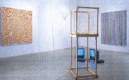
Photo above: "OP at UP" installation view, UP&CO. NYC June 1998
"Op Art" is a term originally coined in the 1960s to describe paintings, sculptures, and electronic devices that dazzle or confound the eye. Resembling the "optical illusions" of experimental psychology, these flickering dots and undulating planes typified the heady atmosphere of that decade, when art and science promised to merge and yield new, ever-more-mind-blowing creations. For a time it appeared that kinetic sculptures, lasers, and holograms would supplant traditional media, as exhibitions with names like "Electromagica" and "Lights in Action" toured the U.S., Europe, and Japan.
What was arguably Op's greatest moment--"The Responsive Eye" exhibition at the Museum of Modern Art in 1965-was also, ironically, its swan song. In the late '60s and early '70s, utopian claims for technology began to lose their gloss, and the winds of art fashion shifted. As artists embraced performance, photography, and texts as their principal media, Op came to be lumped in with the "color field" painting promoted by critic Clement Greenberg, who was reviled as a Richard Nixon-like figure by the conceptualist generation. Also, because Op caught on with designers, decorators, and psychedelic poster-makers, it quickly became tainted as kitsch.
After a long period of visual drought in the art world, Op had a second life in the ?80s, during the heyday of "appropriation art." This time, it came with a thick layer of irony and critique. Reversing Marx's notion that history replays itself, first as tragedy, then as farce, artists such as Ross Bleckner and Philip Taaffe found it necessary to recast what had been wacky fun into a pathetic, "failed movement." In "Painting at the End of History," a 1982 essay on Bleckner, Peter Halley offered a sociopolitical explanation for Op's demise: that it "obeyed perfectly the principle of planned obsolescence of the modernity after which it was patterned." Nevertheless, Op motifs acquired an aura of polish and professionalism in the '80s that would have been unimaginable twenty years before. Bleckner's buff painting surfaces, Taaffe's elegant appliques, and Halley's 50 coats of searing Day-Glo gave collectors the highly-crafted objects they craved, while the artists lampooned their own marketability through the Marxist rhetoric of "commodification."
The 1990s, like the '70s, have been a decade of limits; even the current stock market frenzy has failed to pump the art world back up to its previous steroid-enhanced levels. The themes of this decade have been abjection, "otherness," and interiority, and thus we find Op art reincarnated in yet another set of clothes: from the thrift store rather than Armani or Carnaby Street. The current Op experimenters--including David Clarkson, Mark Dagley, Alicia Wirt, Ray Rapp, and myself--favor the plain-spoken over the artificial, the inept over the expert, and the tease over raw sensation. Our work tolerates, indeed encourages ambiguity, letting the viewer determine whether it is "good" or "bad," ironic or straightfaced, or even whether it is "Op." Aspiring to the tonality of Philip Glass and the idiosyncracy of lounge, it eschews the anger and lugubriousness of the permanent counterculture, yet stops short of escapism. Unlike the abstraction of the Greenberg era, it makes no claim to be divorced from the quotidian, political world.
For example, both Rapp and I use the computer as a tool, but resist its value-system of streamlined perfection. Rapp's video loops of spheres growing and shrinking, made on a simple animation program, bear the same relation to the "trip" sequences of Hollywood science fiction films as a Yugo does to a Mercedes--they're clunky but get the job done. Viewers can be momentarily transfixed by these pulsating mini-spectacles, and then walk away, in contrast to, say, the IMAX theater, where one is hemmed in and relentlessly bombarded for 45 minutes.
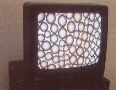
Photo above: Ray Rapp "bubblemation" 1997, computer animation with TV, from "Op at UP" exhibition.
Similarly, my own work treats the computer as a crude means rather than an all-encompassing end. Spheres and tubes are "painted" with a mouse, printed out in bulk, cut apart, and reassembled into giant quilts or mosaics, held together (from the back) with strips of linen tape. As aggressive as '60s or '80s Op, these rumpled sheets have an ephemeral, disposable presence.
Even more evanescent, Wirt's installation pieces tug at our neurotic desire for closure. What appear to be recessed lights on a chevron-shaped ledge give off a multicolored glow. They're actually painted bands of color, spewing reflections onto the white walls, but the height of the ledge keeps one on tiptoes, straining to know for sure. Clarkson, on the other hand, puts everything in open view, like Penn and Teller explaining a magic trick. Affixing plugged-in, 25-watt light bulbs to the surfaces of his monochromatic panels, he tweaks the mystical pretensions of Op and color field painters, who all too often substituted retinal trickery--afterimages, vibrating hues--for metaphysical experience.
In Dagley's work, a premise that could have originated in a late '60s art education textbook ("make a spiral of circles using primary colors") becomes a Herculean ritual of self-imposed labor. Thousands of dots growing from a few millimeters in the canvas's center to a mere inch and a half at its outer edge coil outward in an undeviating sequence of red-blue-yellow, red-blue-yellow, red-blue-yellow. Rocking the eyes like a Bridget Riley, the work has a temporal aspect--and edge of monomania--largely absent from '60s Op.
The sheer resilience of Op over the last three decades suggests that it is an unfinished project, rather the "failure" its '80s practitioners claimed it to be. Regardless of what form it takes, obviously it addresses some deep, ongoing need--for pleasure, the "magical," an understanding of what seduces us, and other fundamental but hard-to-talk-about things.
The preceding text accompanied the exhibition "Op at UP," appearing at UP & Co, New York, NY, in May 1998, featuring the work of David Clarkson, Mark Dagley, Tom Moody, Ray Rapp, and Alicia Wirt, organized by Tom Moody
POST-HYPNOTIC
A Demolition Derby of Art
By Tim Porges
(Originally published in THE OCTOPUS, January 15-21 1999)
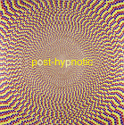
Photo above: "Concentric Sequence" by Mark Dagley, 1996 72x72 inches, acrylic and pencil on canvas
The experience of walking in on the Illinois State University Gallery's Post-Hypnotic exhibit is a sort of visual demolition derby. A bunch of old vehicles -- Op, Arte Povera, psychedelia, post-modernism and so on -- have been rehabilitated and turned loose on each other. It feels dangerous to get between them as they try to knock each other off the wall.
Some are more immediately aggressive than others. Mike Scott's neo-Op stripes actually repel the eye. The hallucinatory color that appears to hover over his surfaces becomes visible only when your eyes lose the battle and slip defensively out of focus. My own best guess about the difference between Scott's work (as well as Philip Taafe's Big Iris) and the mid-'60s Op painters to whom it owes so much is that it's made for an audience that's willing to look at it longer than anyone ever looked at a Bridget Riley, an audience that expects more out of the experience than a headache and visual afterglow. We expect some kind of deeper reward, like the listeners who sat through the endless-loop repetitions of early minimalist compositions. Even in a survey presentation such as this, in which each artist is allowed no more than a single representative performance, we expect some kind of revelation, like the miraculous appearance of Elvis on a taco, but more abstract and less easily defined.
While the roots of this work go deep into the abstractions of 80 and more years ago, the baseline for its audience (in the Universal Boomer Time of contemporary culture) is to be found at mid-century, when Mom and Dad came home from the wars to live the Atomic life. While history (the original abstraction) might repeat its tragedies as farces, art history's primal moments are always already nostalgic, already sturdily farcical in their self-awareness. The moments to which these paintings return us were all moments of recuperative nostalgia. I'm trying to define an edge here, between the two regimens of the art of our time (and maybe they were always there, but nowadays they're up on the surface where everybody can see them): the rule of novelty and the rule of nostalgia. For each of the artists in this show, either novelty or nostalgia offers a way of organizing your first encounter, and then there's the second-encounter switch-over, and you see the novelty that runs in constant parallel track with the nostalgia, making the work simultaneously dated and timeless, shocking and comfy, familiar and uncanny, repellent and attractive. And as your first look is followed by the second and third and so on, this back-and-forth viewing becomes part of the process, part of your repertoire of visual skills. It's a familiar skill, really. You've been developing it for years, playing computer games, puzzling out magic-eye images, reading Ray Gun and Wired, watching MTV. A little recreational drug-taking will take you there, too, though it's not a required part of the curriculum.
As with any demolition derby, the pure spectacle of this show is what it's really all about: the deafening roar of visual noise. The individual contestants (some old heroes from the instant movements of the '80s, some people still on the rising edge of their career curves) each has more to offer than pure spectacle, and like any good survey show this one makes you want to see more by all of them.
Susie Rosmarin's grids push the vibrational, hypnotic potential of the grid to its limit without losing its history as a meditational space. Her paintings are like steroid-enhanced Agnes Martins, and that might not be to your taste (or mine), but I'd sure like to see more of them.
Tom Moody and Aaron Parazette both work along the edge between the most abject low art desktop computers can produce and a delicate, immaculate high-art sensibility. The abjectness of their materials (Moody's paintbox spheres and Parazette's clip-art splash forms) distances them from their conventional sources and makes their work interesting as well as seductive, though it's not what puts them on the menu here. There are weirdly passive-aggressive limits to the pleasure which Parazette's splash-fields provide (obsessively eager to please, but still a smart-ass: a hero of the moment), and there is an equally weird commitment to craft in Moody's quilted surfaces (as well as a graceful, subtle bit of homage to Jasper Johns), but they're on the wall here because this is a candy store, and they are here to be seen first and thought about later.
The primarily visual commitment of this collection allows a lot of visual punning to happen, in a good way. Tom Martinelli's dots don't have a lot in common with Yayoi Kusama's dots, but it's nice to see them in a show together anyway. Similarly, the off-registration bleed of color at the edges of Martinelli's dots resembles, but is conceptually miles and miles distant from, the illusory color-haloes produced by Scott's and Rosmarin's stripes, but it's nice to see them together here, to get a feel for just how much distance that is. Similarly, on the most superficial of levels, Bruce Pearson's acid-Yantra bas-reliefs belong in the same show with James Siena's dense little folk-art Stella knock-offs, and even with Walter Robinson's you-can-do-it, simulationist folk-art spin paintings. But superficiality, the commitment to a surface that becomes the same thing as the picture plane (and then, click/click, is not) is a calling to which every painter must answer, though not always exclusively.
There are 28 painters in this show, and I don't have the space to even write about half of them. There's a frustratingly small taste of Jim Iserman's work here, and a couple of David Clarkson pieces that make me think that a whole show of just his work would tell me a lot more. There are also painters in the show, such as Michelle Grabner and Judy Ledgerwood, who don't deal primarily in visual satisfaction, and kind of get lost in the shuffle here, but are overwhelmingly impressive on their own turf. Oh, and there's a Peter Halley and a Ross Bleckner, some John Armleder prints and some of Fred Tomaselli's hemp-leaf and pill collages, and others -- Mark Dagley, Stratton Cheroun, Steve Di Benedetto, Karin Davie -- but this is the kind of show where the visual noise between the paintings is as much a feature as the names you read and try to remember. More, really.
Post-Hypnotic runs from January 14 through February 21 at the Illinois State University Gallery. A reception will be held Tuesday, January 19 (7 pm), and an artist's reception panel will be held Wednesday, January 20 (7 pm).